Legal

TransferPay logotype usage guidelines

Logo

TranferPay’s logo consists of the word “Transfer” and the word “Pay”. In addition, it is completed with an isotype on the left side that identifies the brand. The colour of the logo is always the same in all the elements and two different colours cannot be combined.

Safe area

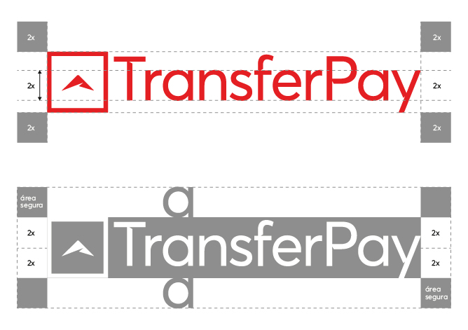
The safe area around the logo is determined by the size of the letter “a”: the safe area is equal to the size of the letter “a” multiplied by 2, like in the example below. The safe area can also be determined by half the size of the isotype.

Sizes

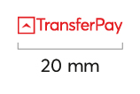
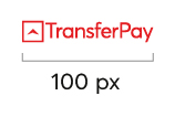
In order for our logo to always be easily visible, a minimum logo size is established. The logo cannot be smaller than 20 mm width or 100 px. The maximum logo size is not limited, although the logo cannot exceed 40% of the whole layout space.

The minimum size of a print trade mark – 20 mm width

The minimum size of the trade mark in electronic form – 100 px

Examples of inappropriate use

1.

Don’t change the logo proportions.

2.

Don’t change the logo colour.

3.

Don’t change the position.

4.

Don’t combine two colours.

5.

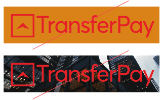
Don’t use the coloured logo on a bright background or photos.

6.

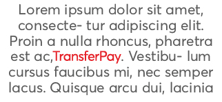
Don’t use the logo in a text.

7.

Don’t change the size of separate objects.

8.

Don’t use shadows.

9.

Don’t use gradients on the logo.

Colours

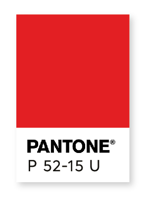
CMYK  0 88 73 9
RAL  RAL3020
RGB  194 82 81
HEX  C25251

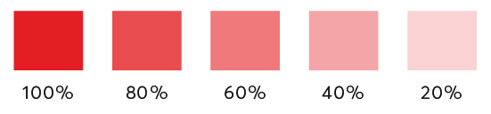
Colour tones

Gradient

Logo colour use

The TransferPay logo can be in white, black, or original (red) colour. The logo and the isotype always go in the same colour, two different colours cannot be combined. If the colour of a layout is colourful or its colours match that of the logo, the white or the black logo must be used, as shown in the example.


ORIGINAL LOGO

BLACK LOGO

WHITE LOGO

WHITE LOGO

ORIGINAL LOGO

WHITE LOGO

In case you want to get more information about the usage of the Paysera logo, please contact with us directly via email at [email protected].